Thursday 19 December 2013

Improved Composition Photos | Still Life Animatic | The Shattered Looking Glass

All the following photos were taken to improve on previous bad photos. I chose these photos as improved photos as they were laid out better and made better use of the rule of three and had much better lighting and contrast levels etc.

This photo improved on the previous one taken because previously the photo was mislaid and did not show any perspective to what was behind it. Furthermore the photo was lacking exact details that could give clues to the plot of the story. Perspective was included in this photo which gave some of the narrative away to the viewer. Also the photo made good use of balancing which meant that the content on the image was not biased to one side.


This photo improved on the previous one because previously the photo took up the entirety of the screen, this meant we as the view had no idea of the perspective or narrative behind the image. The image is improved because there is perspective to it and a clear use of the rule of three.


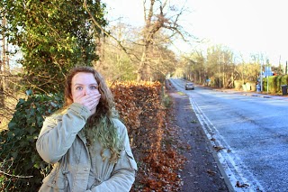
The improvement image is unique because we completely changed the whole idea of the original image. Originally this image was face on and just included the whole of the characters face close up. In this image we have positioned the character to the side. We made this decision because it now looks as though she is looking on to something, furthermore this adds to the other all diversity and narrative of the image. 


This image was originally laid out to have the main character in the centre of the image. Slightly zoomed out and a hazed perspective on it. We improved on that by moving the character to one side and creating a more bold expressive look on the character face. This shows use of spacing and the rule of three. It also shows simplicity within the image.


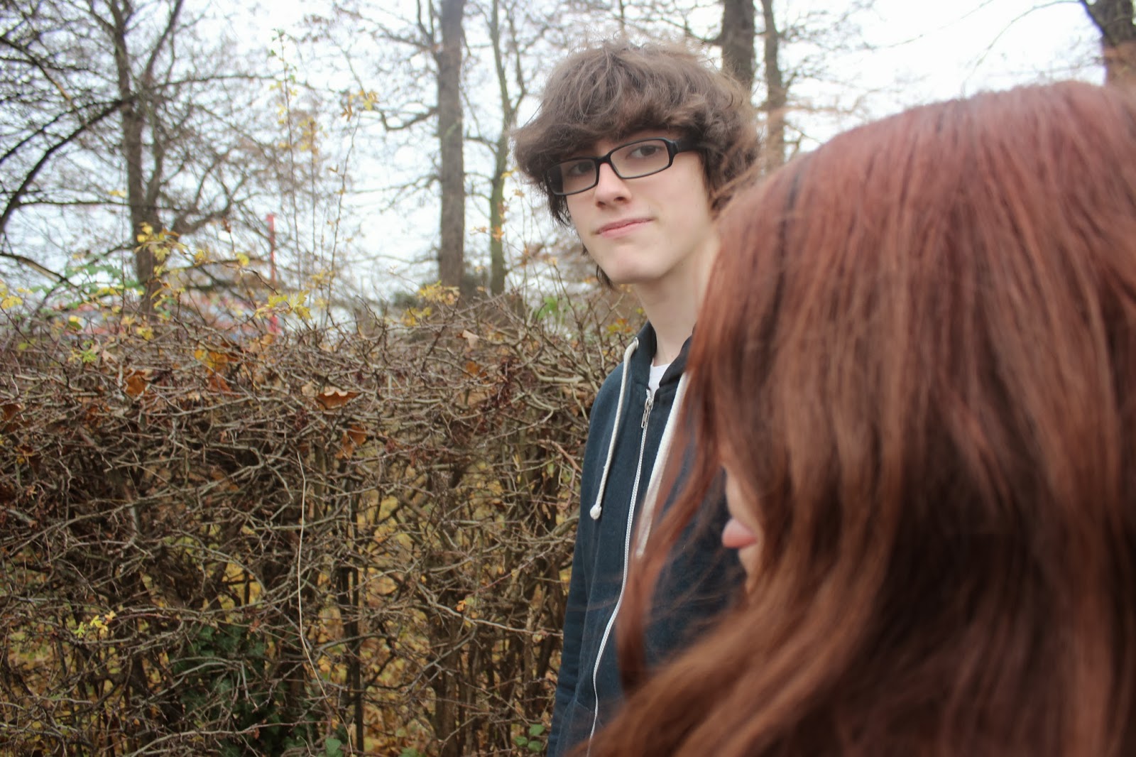
This image originally was laid out shockingly. It was the only portrait image in all of our photos and it was the only out of focus image in all of our photos. We improved on that original by once again re thinking the layout of the image. This meant analysing the scene for the most best positioning of the character. We also changed the expression on the characters face as well as using the rule of three to show background content in the image.


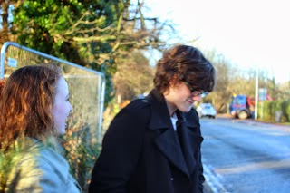
This was the last image that we improved on and we did so by improving layout, look and how we conveyed the narrative. The narrative is clear in this improved image by the clear look on the characters face. It also shows a clear use of the rule of three, which was an improvement on the original image, furthermore the background of the image is slightly blurred which not only adds to the narrative it adds to the overall diversity of the image.

Wednesday 18 December 2013

Bad Composition Photos | Still Life Animatic | Shattered Looking Glass

This photo is considered to be bad because the characters face is directly in the centre of the shot. Rather then using the rule of thirds, placing the character off to one side not in the centre, the character is directly in the middle. Although this photo does offer a nice background and some good contrasting colours.

I chose this photo as being bad because there is a lot of empty space within it which could of been utilised well. The point of this shot was to highlight the main character which could of been done a lot better by off setting or utilising the natural set better.

I chose this photo as bad because there is nothing to it. Granted the photo offers a sense of narrative the image is just over all confusing. Moreover no real facial expression is exposed or any kind of hint as to what is to happen in the photo.

I chose this photo because it lacks on every basic rule of taking photos. It is blurry and dodgy taken. The main character is in the centre of the screen showing complete disregard for the rule of Thirds. This photo could of been improved by using a more dynamic camera angle.

I chose this photo because there is too much light shining in. There is only one main focus in the image which is not positive. The photo is also blurry and the colour contrast is off. Although the photo is balanced and in some ways symmetrical its not perfect. The viewer gains nothing from looking at the blank background.


I chose this photo because it is clear of many different errors. Although some narrative is offered through the expression on the female characters face. The photo is very plain meaning there is not much too it. The character is centred which means the Rule of Thirds is out the window and the main action takes up the whole photo. Although there are some good contrasting on the leaves and the characters hair overall the colour is fairly dull and lifeless.

Good Composition Photos | Still Life Animatic | Shattered Looking Glass

I had decided that this photo was a good one because it was shot in a dynamic way. Although most of the action is biased to one side, the background balances out the image offering an overall contrast. It also shows evidence of considering the rule of thirds.

I also chose this image because it was laid out well and it showed some narrative. It shows the character looking at the other character in a serious way which shows the viewer a story. Depth of focus was also used intentionally which creates two sides to the image, over all it creates a serious photo and therefore the viewer expects a serious narrative.

I chose this photo as a good photo because it combined many different professional photography elements including depth of field and rule of thirds, as well as balancing the image. All of these elements combined creates a great artistic photo that works well. The varied focus creates an element of confusing for the viewer and makes us pause. The whole image is not centred, it is spread throughout the shot which creates a bold and full on effect for the viewer.

I chose this photo because out of all the photos it offered the most narrative rich look. For the photo the viewer gets an idea of what is happening between the two characters, for example they might be walking away from fears, alternatively they could be going for a stroll. The background gives the illusion that more is to come also.

I chose this photo because it wasn't laid out conventionally, the Rule of Thirds was used in this photo to make sure that the character was not placed directly in the middle of the photo. The viewer can see building in the background behind the character which could be beneficial to the plot. The colour of the hair also matches with the bricks on the buildings which offers nice contrast.

I chose this image because it was balanced out well, by this I mean there is action on both sides of the photo. The photo is also clear which creates the narrative that there are clearly some issues to be worked out. Although there is a lot of unused space around the characters granted there is also good narrative.


Tuesday 17 December 2013

Matte Painting Special FX Research

Matte Painting is a process used in film making and Television Programme Creation. It involves the unique technique of combining two or more image elements to create the desired effect, doing this the user can usually create different scenes or dramatically change a scenes look. Mattes could range from a small portion of the camera shot to covering the whole canvas, this means the user can change small amounts within a shot or drastically change the whole outlook of a shot.

Concept of Matte Painting, General Example
Matte Screening is a classic Film Making Special Effect, dating back to the Lumière brothers generation of Film Making. Matte Screening was used from as early as the 1880's using in camera cut outs. Classic Matte Screening would often literally involve placing a cut out of an object in camera whilst filming. Cut outs were often made of glass and many other materials. A good early example is The Great Train Robbery in 1903 where it was used to place a train outside a window in a ticket office. And later a moving luggage cart. From then on the technique has been developed and we can see it being used recently in the 1980'sin Young Sherlock Holmes.

A great example of the use of matte Painting in a film would be Raiders of The Lost Ark, which was produced in 1981. It painting was famous for being tremendous and unlike most of the Paintings of its time was held on screen for a considerable amount of time. It worked because it created a very atmospheric effect that could not be duplicated through standard film. The Matte Painting featured a 'Blocked in' look which created a Grand Result from a huge Talent. As demonstrated through the picture below. The top being the original take with post production work done, and the bottom being the final take with Matte painting featured.

Raiders of the Lost Ark Matte Painting
Sources:

Final Still Photo Animatic - Shattered Looking Glass

Shattered Looking Glass - Scene Breakdown Sheet

Tuesday 10 December 2013

Short Story Character Overview: Jason


Character Mood Board: Jason

The following is a mood board that group member Rory created during lesson, it symbolises the character Jason.


Short Story Character Overview: Alexis

Alexis is a 17 year old girl, she is often found nose deep in a book studying for a test or just to get a litte but more ahead than she already is, alexis is the top of the class in all of her classes but she's still modest about it, she comes from a large family of 2 brothers, 14 and 19, and a sister, 23. Her parents are the owners of a small general store in alexis' home village, westerhill.

Alexis has always found that she can get mad too easy and this often has negative impacts on people that get close to her.
Alexis has always wanted to leave the academy and make people with powers out in the real world more accepted and treated better.

Character Mood Board: Alexis

The following is a mood board that I created during lesson, it symbolises the character Alexis.

Alexis' Character Mood Board

Sunday 8 December 2013

Green Screen Reseach

green screening is using one main colour board or sheet to create special effects. Commonly used in the 20th century one main coloured piece of carpet or board would be placed behind the actor and the scene would carry out. The footage would then be taken into post production stages where it would be edited so that the main colour of the board is made to disappear giving the illusion of a transparent background. From there a different background scene can be added to create the illusion of a character being in a different place.

You commonly see the green screen editing methods used in older films and TV programmes before modern editing and CGI was created. This was because modern technology was not created to be able to create non green screen used effects. Green screening was commonly used in action films and can be best seen in classic wild west films as it was often a more suitable cost effective alternative to building a set. In modern days its main use is for small effects, for example a flame on a hand or head swaps.

An excellent example of where green screening was used would be in a movie named "The Worst Film Ever Created". "Birdemic" Is a film created in 2007 and is about a group of friends who are travelling when birds attack. Its famous for its massive amount of panning shots and its terrible acting. In this scene birds start to attack the main characters as they leave the motel. The characters attempt to defend themselves using coat hangers.

Green screen and chroma keying effects were used in this shot because it was thought that that would be the most effective way to display these birds attacking. The effect is overlaid over the original footage to create the effect.

Animatic Self Review

Within the group it is important that we each reflect and self review each others work. Breaking it down into 6 main parts which will make up the overall review.

Shot Length
The average shot length in Hollywood is 2.5 seconds so it was important to us to score the same or just over that to achieve a high quality finish. Our average shot length is 3 seconds, which is exeptable to complete our sequence, each shot does not equal that exact length they are all various length of clips. Its important to include a wide range of lengths as this creates variety in the clip.

Camera Movement
In my Animatic it is clear which shots are moving and which shots are static. You can tell which are which depending on whether a shot has arrows going across it or not. One of the tracking shots is also clearly demonstrated but the frame moving on in a sliding motion.

Sound Levels
The sound levels in my Animatic remains at a constant level although there are additional sounds that cut in here and there for example, a hand swatting noise or a clicking sound, sounds which are generally considered non dietetic and have been added manually. It was important that all these additional sounds fitted in well with the dialogue pieces. To do this we had to asses the volume level of each clip individually upon end review of the final Animatic. There was addiquit sound before and at the end of each sound clip for it to make sense and run smoothly.

Voice Acting
The voice acting that was featured and recorded by team members in the group was done to a professional standard. Although the majority of them sounds very convincing a few do not and some of the sounds even included additional sound at the end which do not need to be there. Our current actors will be sufficient to complete the rolls required.

VFX
In the Animatic it is clear where visual effects occur, although not so clear at first it soon becomes apparent and clear where they occur. Additional screen stage directions are also included in the frame if it is not so clear.

Peer Feedback
Additional peer feedback I received about my Animatic was very good, most comments including the fact the whole thing flowed well, it had a good pace and clearly showed each shot. Although the visual effects were not clear for a couple of people, they soon understood where they occurred.
Overall I received positive peer Feedback.

Location Scouting Part 2

Location Scouting Report Sheet
This was the scouting sheet that we filled out prior to taking location panorama shots.


Location recce

Floor Plan /Map
The Floor Plan is essential for us to know exactly how the scene is laid out. Although our Map is simple, we ere unable to add much detail as there was not sufficient detail at the location.


location Plan /Map


Panorama Images
These Panorama images were taken to directly present and demonstrate the scene. In a practical and up from sense. They help us to work out where each character and shot will start.


Overview - left to Right
Shot From Right
Shot From Right